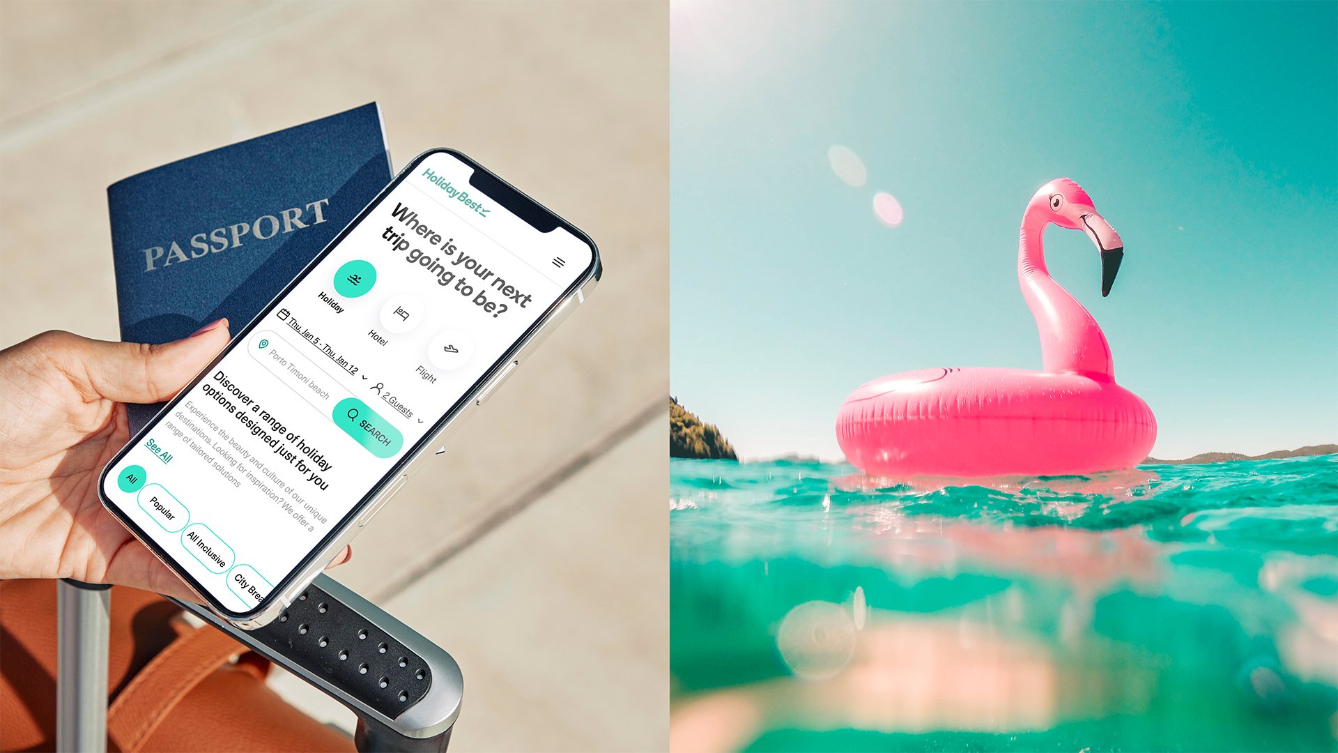
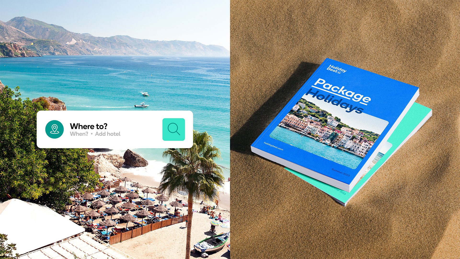
Every customer seeks a holiday experience that resonates with them personally. Each location offers a distinct array of amenities, weather conditions, excursions, and cultural encounters. Often, when we describe exceptional holidays, we incorporate storytelling to recount significant and defining moments of our time away from home.
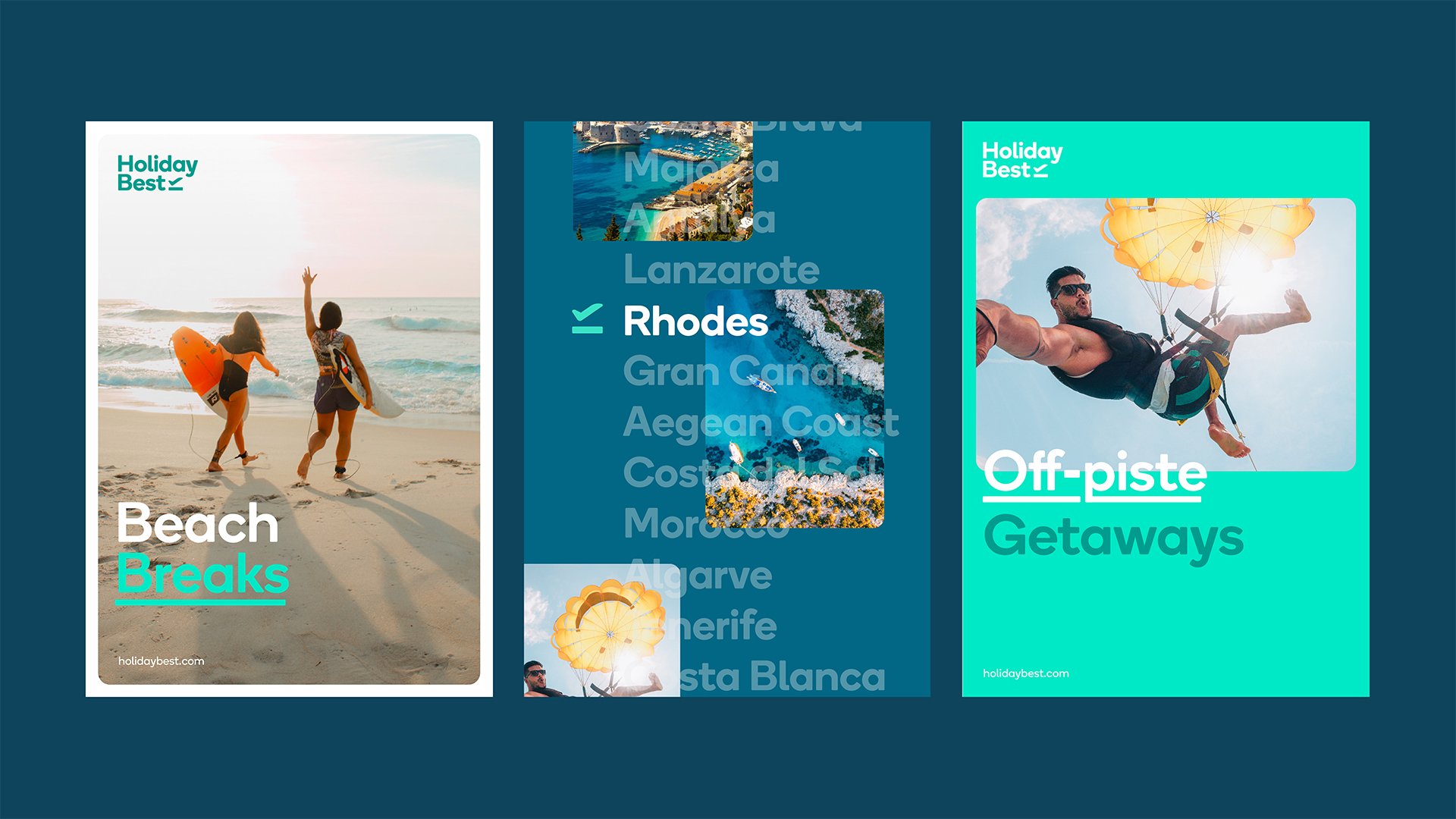
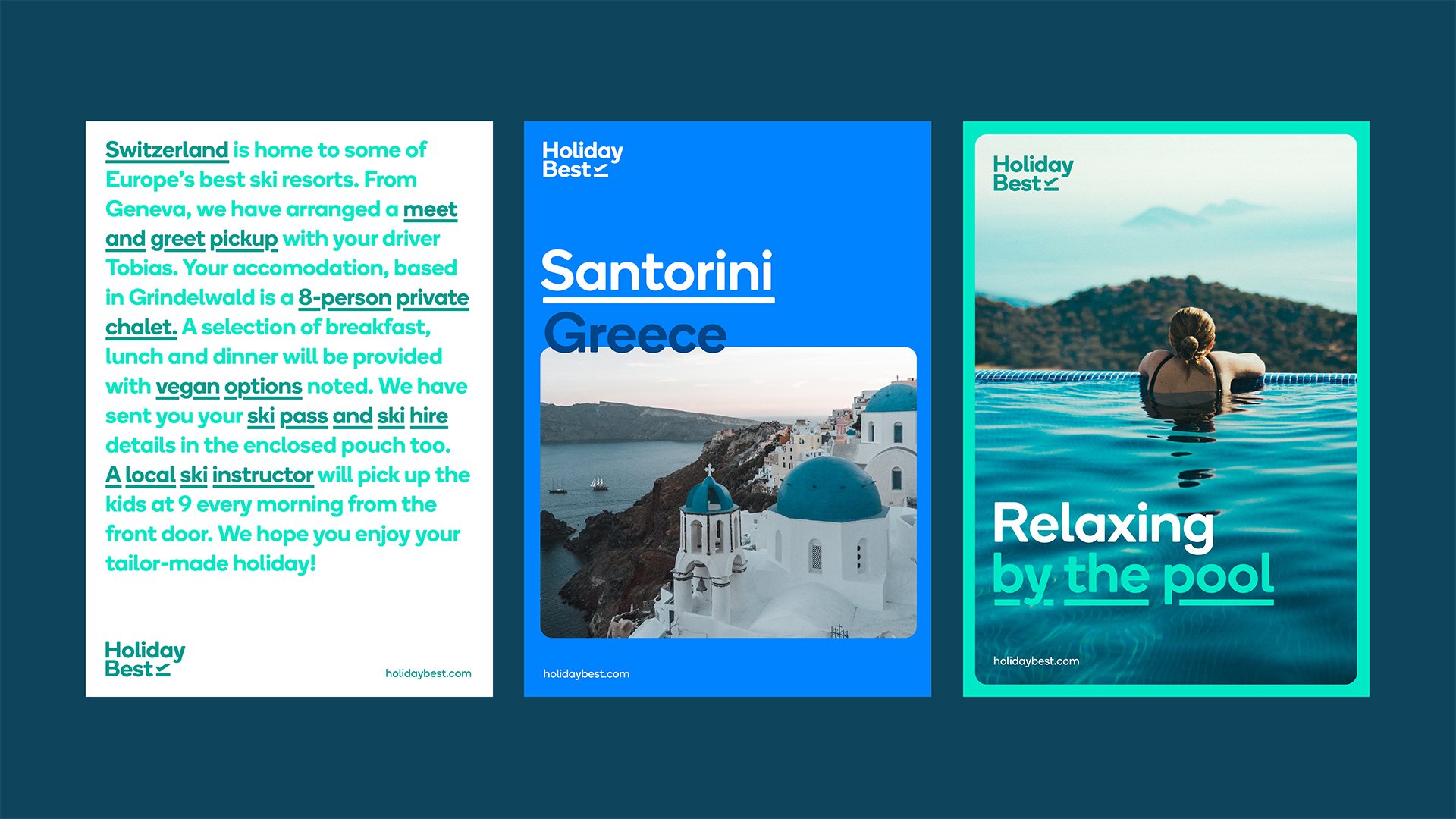
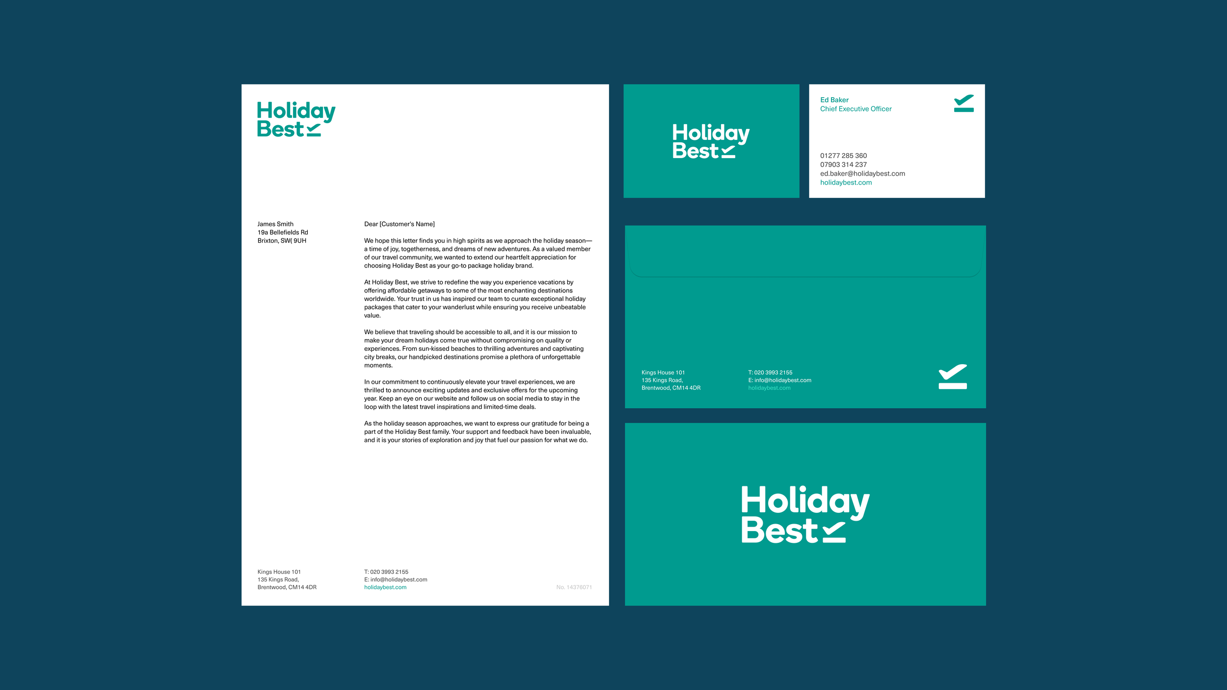
We developed a brand system that utilised an ‘underline’ highlighting device to define what ‘best’ entails, emphasising key benefits and experiences individuals seek in their holiday. This device was consistently employed in imagery and copy, serving as a focal point that signifies quality.
The underline motif also took the form of the aviation symbol within the primary logo lock-up. Drawing inspiration from the departures symbol familiar at airports, we crafted a symbol embodying the concept of ‘Defining best.’ It resembled not only a check-box but also a plane taking off to a sun-kissed destination.
Being a young and new brand, Holiday Best required a visual execution that would bring the strategic direction to life. This execution needed to be relatable and resonate with a wide audience demographic, ranging from families and young couples to empty nesters and individual travellers.
To achieve this, a vibrant colour palette reminiscent of the Mediterranean locations Holiday Best ventured to was introduced. This palette conveyed a fresh feel and an open atmosphere, enabling the brand to stand out from other package holiday providers while also comfortably fitting within the market. Ensuring that photography showcased a narrative customers could envision themselves experiencing was crucial; it needed to feel natural, honest, and unposed. Through typography and copy, the brand’s personality was allowed to shine, utilising a rounded sans-serif as their brand font. This choice of font conveyed an approachable character and the sense of enjoyment a holiday can bring.
“We are with our customers at every step of their experience –
because we believe that’s the way travel should be. Best means a lot to us.
That’s why we are continually working to be more efficient and effective—through our technology, to in-resort experiences.”


